Reading Your Performance and Training Load Balance Graphs

Open an athlete’s summary and you get a sum of their daily ECOs score, session by session, stacked over weeks. On its own, a single score really doesn’t tell you much. It cannot tell you whether the athlete is rounding into form or quietly digging a hole they won’t climb out of by race day. That read, the one you actually coach from, shows up only when you step back and watch the scores accumulate. On EndoGusto, two graphs do that work: the Performance graph and the Training Load Balance graph.
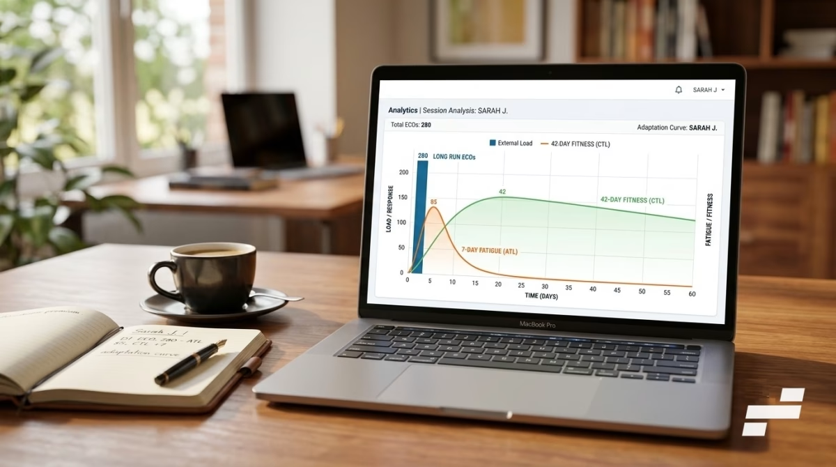
The Performance graph, also known as the FFF graph, turns the daily ECOs load scores into three lines: Fitness, Fatigue, and Form. Fitness is the deep, slow-built capacity an athlete carries from week to week. Fatigue is the recent cost, the load still sitting in the legs. Form is the gap between them, the line that tells you at a glance whether someone is sharp, buried under load, or treading water. The Training Load Balance graph asks a different question entirely: how hard is recent training pushing compared to what the athlete is already adapted to?
Both graphs start from the same premise: they measure external load, the objective work an athlete performed, not the physiological stress that work created inside the body. That one distinction is the source of most of the confusion about what these graphs are saying, so we will keep coming back to it.
Used well, these two graphs turn a season of daily scores into a read you can take at a glance: how much fitness an athlete has banked, how much fatigue they’re carrying, and whether the latest push is building them up or digging them in. The rest of this article is how to get there. We’ll walk through what each graph measures, the science it’s built on, and how to read the two together, so the next time you open an athlete’s summary the lines tell you a story, not just a number.
Key Takeaways for Coaches
- A single ECOs score is only a data point; coaching decisions come from the accumulated trend across days and weeks, not one session.
- Both graphs measure external load, the objective work performed in ECOs, not the internal, heart-rate-based stress response to that work.
- Fitness is a 42-day weighted average of daily ECOs, Fatigue is a 7-day average, and Form is Fitness minus Fatigue.
- Training Load Balance divides a 7-day load average by a 21-day one; 0.8 to 1.3 signals well-managed progression, and above 1.5 flags a sharp spike relative to baseline.
- The four balance zones are coaching reference ranges, not injury predictions, so a red zone is a prompt to investigate, not a diagnosis.
What the Training Load Balance and Performance Graphs Measure
The Performance and Training Load Balance graphs measure external load: the objective work an athlete completes, expressed in ECOs. External load is the training you prescribe and the athlete performs, such as time spent at a given pace or power. It is separate from internal load, the body’s physiological response to that work. In short, these graphs track what was done, not how hard it felt. For a full explanation of the ECOs methodology, check out our ECOs Training Load Explained article.
That separation is not a casual word choice. Impellizzeri, Marcora, and Coutts (2019) lay out the framework directly: external load is the prescribed physical work, measured in units specific to the activity, while internal load is the psychophysiological response to that work. Both matter. However, they answer different questions, and a graph built on one cannot quietly stand in for the other.
ECOs is an objective external-load metric, and it anchors to pace and power first for exactly this reason. The practical payoff shows up fast. Two athletes who complete the same prescribed threshold session earn the same external load, even if one ran ten beats higher that day on bad sleep and a hot evening. As a result, the number is reproducible and comparable across athletes and across weeks. It does not drift with caffeine, heat, or cardiac fatigue the way a heart-rate figure does.
Pace and power are not always there, though. A session prescribed by feel, or logged without a power meter, arrives with neither. When that happens, ECOs estimates the same zones from the next best signal: threshold heart rate, then maximum heart rate, then RPE, which maps onto an ECOs-equivalent scale of its own. The athlete still gets a score on the same scale, so the trend stays continuous. That score is an estimate, however, and it leans on internal signals, so it carries more noise than a pace- or power-derived one. This is the practical reason we ask coaches to enter each athlete’s pace and power thresholds. It keeps the load objective at the source, and it is why a session prescribed in RPE still returns a usable ECOs rather than a blank.
Even with clean pace and power data, there is a limit to what these graphs see. They will not tell you that the ten-beats-higher athlete was under more strain. That is internal load, relative to the individual, and we come back to it at the end.
From a Single Score to a Trend
One ECOs score is a transaction. A 95-ECOs ride on Tuesday means one thing after a recovery week and something else after three hard ones. The score is identical; the context is not. So a single number, on its own, can’t tell you what to do next.
Fitness and fatigue also operate on different clocks. Fitness builds slowly over weeks and lingers. Fatigue spikes within a session and clears within days. Because of that, what you care about is rarely today’s score in isolation. Instead, you want to know how much load has piled up, how recently it landed, and how recent training compares to what the athlete is already adapted to.
Consider two athletes who both total 600 ECOs this week. The first stacked it into two brutal days. The second spread it evenly and has averaged the same 600 for a month. Same weekly number, very different stimulus. The graphs exist to make that difference visible, and to do it they have to aggregate the daily scores in a way that respects how adaptation actually decays.
The Performance Graph: Fitness, Fatigue, and Form
The Performance graph is built on the fitness-fatigue model, first described by Banister and colleagues in 1975. The idea is simple and durable. Every training impulse produces two responses at once: a slow-building, long-lasting fitness effect, and a fast-building, fast-clearing fatigue effect. In Banister’s model, performance at any moment is what remains when you subtract the second from the first.
The graph shows this as three lines.
- Fitness (often labeled CTL): your long-term external load, calculated as a 42-day exponentially weighted average of daily ECOs.
- Fatigue (ATL): your short-term load, a 7-day exponentially weighted average.
- Form: Fitness minus Fatigue, the gap that tells you whether an athlete is fresh or dug in.
Why external load works as the input
One fair challenge is whether this framework holds up when you feed it external load, since Banister’s original model ran on a heart-rate-based impulse. Vermeire and colleagues (2021) fitted the fitness-fatigue model with six different load inputs, including power-based training load and raw kilojoules of work, and the external measures tracked performance with error comparable to the heart-rate methods. Two honest points come from that same study, however. The inputs are not interchangeable, because each implies slightly different timing. And the validated, predictive versions of this model fit their constants to an individual athlete’s test results. EndoGusto’s Performance graph instead uses standard windows, so read it as a monitoring view of how load accumulates and clears, not an individually calibrated performance forecast.
Why fitness and fatigue use different windows
The two windows exist because the two responses fade at different speeds in the athlete. The fatigue from Sunday’s long run is mostly gone by Thursday. The fitness that same run contributed is still there a month later. A 7-day window captures the first; a 42-day window captures the second. To illustrate, this is precisely why an athlete’s Form climbs during a taper. Fatigue drains away faster than fitness does, so the gap between the two opens up in the athlete’s favor.
Why a decaying average, not a rolling one
Both lines use an exponentially weighted moving average, or EWMA, which gives recent sessions more weight than older ones. The update is straightforward: today’s value equals today’s load times a smoothing factor, plus yesterday’s value times the remainder. That factor is set by the window, with lambda equal to 2 divided by (N plus 1). For Fitness, a 42-day window puts lambda near 0.047; for Fatigue, a 7-day window puts it at 0.25.
A plain rolling average would treat a session 41 days ago exactly like yesterday’s, then drop it off a cliff on day 43. Adaptation does not work in hard cutoffs; it fades. Williams and colleagues (2017) and Murray and colleagues (2017) both make the case that an exponentially weighted approach reflects this decay more faithfully than a flat rolling window. One practical note: rest days count as zero load and still update the average, which is why Fitness ticks gently downward across a rest block rather than holding flat.
The Training Load Balance Graph
The Training Load Balance graph is the ratio of recent training load to the load an athlete has adapted to. It divides an acute, 7-day exponentially weighted average of ECOs by a chronic, 21-day one. A value near 1.0 means recent load matches the established baseline. Higher means the athlete is pushing above it; lower means they are easing off.
The acute average uses a 7-day window (lambda 0.25). The chronic average uses a 21-day window (lambda near 0.091). Critically, the two are computed uncoupled: the chronic window excludes the acute period rather than containing it. This matters more than it looks. When the recent window sits inside the long window, the two move together by construction, which can manufacture correlations that are not real. Lolli and colleagues (2019), along with Windt and Gabbett (2018), document this mathematical coupling problem directly. Uncoupling keeps the comparison honest.
How to read the four zones
The graph bands the ratio into four reference ranges. The table below is the quick read; the context underneath it is the part that actually coaches.
| Ratio | What it suggests |
| Below 0.8 | Low stimulus; load has dropped below the adapted baseline |
| 0.8 – 1.3 | Well-managed progression |
| 1.3 – 1.5 | Elevated; recent load is climbing fast, worth watching |
| Above 1.5 | Sharp spike relative to baseline; review the week |
These ranges are not verdicts. A ratio of 1.4 the week after a planned training camp is expected and fine. The same 1.4 in an athlete who has been steady for months is a different conversation. Read the number against the plan, not in a vacuum.
This is not an injury predictor
The zones are coaching reference ranges, not a risk score. The acute:chronic concept these thresholds draw on (Gabbett, 2016) has since been re-examined hard. Impellizzeri and colleagues (2020) argue the ratio should not be treated as a causal injury model at all. So a red zone is a prompt to look, not a diagnosis. It tells you load spiked relative to baseline. It does not tell you why, or whether that spike matters for this particular athlete on this particular week.
Reading the Two Graphs Together
A worked example shows why neither graph is enough on its own. Take a masters runner who has held a steady 450 to 550 ECOs per week for two months. Their Fitness line is flat and stable, Form hovers near zero, and Training Load Balance sits around 1.0. Everything is in equilibrium, which is fine for maintenance but won’t drive progress.
Now the coach adds a three-week build, ramping toward 800 ECOs per week. Watch both graphs respond. On the Performance graph, Fitness rises steadily while Fatigue rises faster, so Form drops and goes negative. Meanwhile, on the Training Load Balance graph, the ratio climbs into the 1.3 to 1.5 band. Read in isolation, that elevated balance might look alarming. Read together with the Performance graph, it tells a coherent story: the build is working, the cost is real and expected, and the athlete is carrying planned fatigue.
The plan then writes itself. A down week follows. Fatigue falls quickly, Form rebounds and crosses back above zero, and the balance settles toward 1.0 as the chronic baseline catches up to the new, higher load. The two graphs answer different questions throughout. Performance tells you where fitness sits and how deep the hole is. Balance tells you how fast you got there relative to baseline. You need both to make the call.

What These Graphs Don’t Tell You
Everything above is external load. It is the dose, not the response. Two athletes can complete the identical prescribed week, land on identical Fitness, Fatigue, and Balance numbers, and still be in completely different physiological states. One slept eight hours and trained in cool conditions. The other fought a head cold through a heat wave. The graphs cannot see that difference, by design, because they measure the work and not the body’s reaction to it.
That blind spot is the point, not a flaw. A number that drifts with sleep, heat, and yesterday’s stress cannot anchor a season. External load can, because it measures the work itself, the same way every time, which is exactly why it belongs at the base of the picture. Heart rate and perceived effort measure something different and equally real: how a specific athlete, on a specific day, absorbed that work. Both belong in a complete read. But you cannot interpret the response until you know the stimulus, and the stimulus has to be objective. So these graphs start with the dose. The response side deserves the same rigor, and it is exactly where we go next: a full look at internal load, what shapes it, and how it works alongside the objective account these graphs give you.
Reading the Season, Not the Session
The Performance and Training Load Balance graphs turn a season of daily scores into a picture you can coach from: fitness against fatigue, recent load against the baseline an athlete has earned. Taken for what they are, an objective account of the work done over time, they sharpen the calls you already make, when to push, when to hold, and when to let form come up. That is what putting the work on a graph buys you. Not a replacement for your read on an athlete, but a longer memory and a steadier eye.
Suggested References
- Banister EW, Calvert TW, Savage MV, Bach T. (1975). A systems model of training for athletic performance. Australian Journal of Sports Medicine, 7, 57–61.
- Calvert TW, Banister EW, Savage MV, Bach T. (1976). A systems model of the effects of training on physical performance. IEEE Transactions on Systems, Man, and Cybernetics, 6, 94–102.
- Vermeire KM, Van de Casteele F, Gosseries M, Bourgois JG, Ghijs M, Boone J. (2021). The influence of different training load quantification methods on the fitness-fatigue model. International Journal of Sports Physiology and Performance, 16(9), 1261–1269.
- Impellizzeri FM, Marcora SM, Coutts AJ. (2019). Internal and external training load: 15 years on. International Journal of Sports Physiology and Performance, 14(2), 270–273.
- Impellizzeri FM, Rampinini E, Marcora SM. (2005). Physiological assessment of aerobic training in soccer. Journal of Sports Sciences, 23(6), 583–592.
- Williams S, West S, Cross MJ, Stokes KA. (2017). Better way to determine the acute:chronic workload ratio? British Journal of Sports Medicine, 51(3), 209–210.
- Murray NB, Gabbett TJ, Townshend AD, Blanch P. (2017). Calculating acute:chronic workload ratios using exponentially weighted moving averages provides a more sensitive indicator of injury likelihood than rolling averages. British Journal of Sports Medicine, 51, 749–754.
- Lolli L, Batterham AM, Hawkins R, Kelly DM, Strudwick AJ, Thorpe R, Gregson W, Atkinson G. (2019). Mathematical coupling causes spurious correlation within the conventional acute-to-chronic workload ratio calculations. British Journal of Sports Medicine, 53(15), 921–922.
- Windt J, Gabbett TJ. (2018). Is it all for naught? What does mathematical coupling mean for acute:chronic workload ratios? British Journal of Sports Medicine, 53(16), 988–990.
- Impellizzeri FM, Woodcock S, Coutts AJ, Fanchini M, McCall A, Ward P. (2020). What role do chronic workloads play in the acute to chronic workload ratio? Time to dismiss ACWR and its underlying theory. Sports Medicine, 51, 581–592.
- Gabbett TJ. (2016). The training-injury prevention paradox: should athletes be training smarter and harder? British Journal of Sports Medicine, 50(5), 273–280.